Designing a Seamless Merchant Onboarding System
Connecting self-service onboarding, sales-assisted setup, and complex merchant account management.
My Role
Product Designer
Company
Global Payments
Year
2026 - Present
Due to Non-Disclosure Agreements, some visuals and data have been recreated and kept to a minimum. The designs presented reflect the original problem-solving approach and user experience decisions.

OUTPUT
OUTCOME
IMPACT
Overview
Current Workflow
Business Problem
Problem Statement
Approach
The Flow
Design Decision 01
Design Decision 02
Design Decision 03
Design Decision 04
Conclusion
01 - CURRENT WORKFLOW
Spreadsheet formatting and switching between tabs
Currently, a group of salespeople made their edits on existing spreadsheets of groups of merchant accounts and switched between different tabs to obtain their desired results.
Gather Merchant Information
Determine concession offer to merchant
Submit agreed upon pricing to CRMs for implementation
02 - BUSINESS PROBLEM
Disconnected processes, inefficient pricing proposals and slow approvals.
Due to having individual workflows and sheets that each salesperson worked on, processes were disconnected and messy. Each user setup their own workflows and the reasoning often got lost.
The solution was to create a platform that would serve as the go-forward solution for retention teams across the entire Global Ecosystem, focusing on specific talking points with customers, thus resulting in lower overall attrition and more long-term relationships with our existing customer base.
This required constant communication and workshops with the retention team to figure out a process and template for salespeople to follow.
“ After confirming a deal with a customer, I realized that I had missed out on a few pricing dependencies and the approval was rejected. “
03 - PROBLEM STATEMENT
Calculating Totals for chain accounts is very time-consuming and error-prone.
Through user interviews with the sales teams and stakeholder interviews with the Product Manager, Business Analyst and Product Owner, a major theme emerged.
A large majority of our customers were merchants with financial accounts spanning multiple locations. Each location is mapped to an individual Merchant ID which comes together as a Chain Account. Every parameter of a MID is mapped to variables dependent on one another. These pricing dependencies reflect in totals based on which approvals are requested.
Audit existing workflow and noted all the bottlenecks in the process
Mapped out a Ishikawa Diagram to understand the different sections contributing to bottlenecks
Answered each bottleneck in the section using the 5Whys Approach
Iterated and designed each moment to produce an uninterrupted flow.
04 - APPROACH
Multiple Problems. Four Major Themes. Focus on the details, the whole takes care of itself.

05 - THE FLOW
Four moments, one uninterrupted flow.
Here's the journey a salesperson actually walks, from reviewing merchant account information on their home screen to formulating the best deal for merchants. Each moment was designed to remove a specific hesitation.
01
Discover : Multiple Account Relationships
Users search for the merchant account based on the filter information.
02
Set Up : Browse Account Information
Prime users for what's to come based on account characteristics
03
Take Action : Calculate
Trial and Error, mix and match to arrive at the best deals and discounts for merchants.
04
Review And Send
Once processing totals are calculated and reviewed, export report to merchant.
06 - DESIGN DECISION 01
Prime Users Before Exposing Complexity
During diary studies with users, I noticed moments of hesitation and stress when the first excel sheet opened. Rows and rows of information lined up on their sheets and they speedily began to switch between sheets, studying information and applying them.
Progressively Disclosing Account Information before Pricing Details
Excel opened up rows and columns of information head on for users. Instead, users need to understand what they're working with before they can safely manipulate pricing.
Pros
Everything visible - user can go into different sections based on the information needed
Cons
Overwhelming, a lot of information displayed
Pros
Guided
Minimal Mistakes
Cons
Slow and limited flexibility for expert users
Pros
Low cognitive load
Supports experts
Faster
Cons
Slightly more interaction
The first page had to feel like an introduction to user, not something to get immediately working on. I created an intermediate page to acquaint the user with the account information to prime them for what's to come.

Turning Complex Account Data Into a Clear Structure
Account information was extensive and organized around the system's data structure, making it difficult for retention advocates to identify the information relevant to their immediate task.
I used task-based card sorting to understand how users naturally grouped account characteristics while completing common pricing tasks.

Organizing Account Information Around User Tasks
Rather than exposing every account characteristic upfront, I grouped related information into task-oriented cards, allowing users to start with what they were trying to accomplish and progressively access the details they needed.

07 - DESIGN DECISION 02
Task-oriented parameter discovery.
Out of all the tasks that users carried out, parameter-finding was the most important and time consuming.
Since all actions are carried out on these parameters which are dependent on each other, it was important that users viewed all the information simultaneously before making an informed decision.
Even after finding an account, users struggle to identify which parameters matter.
Displaying individual account parameters is rather straightforward. A grid-like format and work was done. For rows of MIDs belonging to the same chain, account display required more brainstorming.
I chose a flexible, Column Filtering system because it gave users the space to scan all possibilities before making an informed decision.

Different Account Types. Different Layouts.
For quicker recognition and easier editing, individual and chain accounts were intentionally visually differentiated. It allowed for quicker recognition of account type and corresponding deals given required comparitively lesser cognitive load.


The entire website structure. I put emphasis on the individual and chain account since the primary decisions relating to merchants were to be made when deciding for account size and structure.
08 - DESIGN DECISION 03
Simultaneous edits and calculations to ensure the best deals and discounts
Calculating for individual account pricing carried almost no complexity. Users entered the edits on the go, determined the totals and could confirm with merchants.
Chain Accounts carried a different kind of complexity. With MIDs ranging in the hundreds, it was important for salespeople to trial-and-error deals, compaare different pricing plans before arriving at a conclusion.
Back To School - Calculating And Determining Answers
Chain Accounts required simultaneous updates and edits to individual fees. Based on salesperson understanding, they would group together accounts belonging to each other and update their fees likewise.
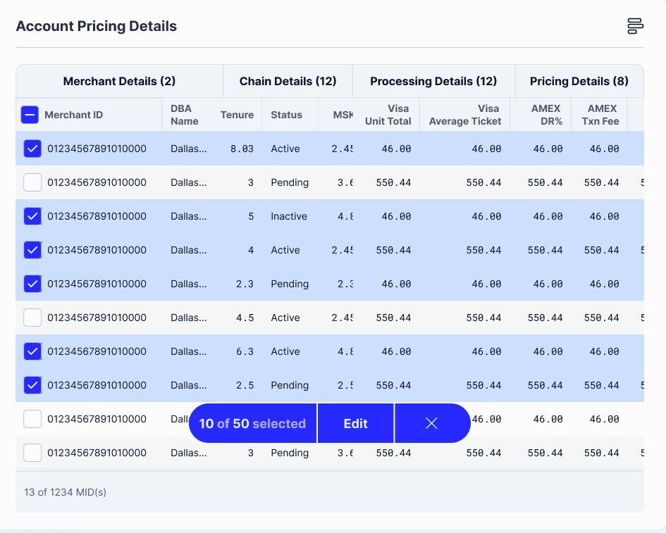
The largest viewable area was given to viewing the merchant IDs. Once the user confirms that all the variables needed have been selected, they can select the edit button.
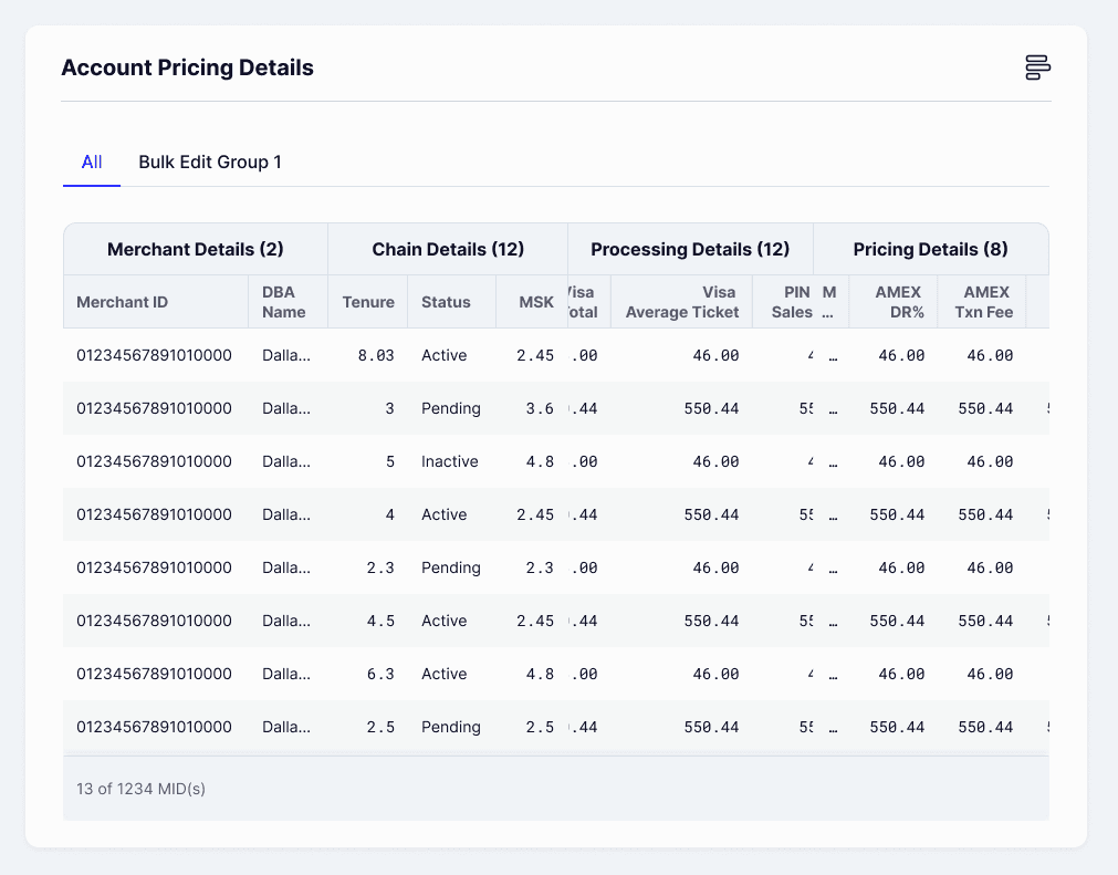
Once the edit button is clicked, the user can no longer add any more variables. Similar to how we calculated sums in school,the viewing area decreases, the rough work column appears on the right side, listing out individual parameters that the user can edit all at once.

Pricing isn’t a single calculation. It’s a negotiation.
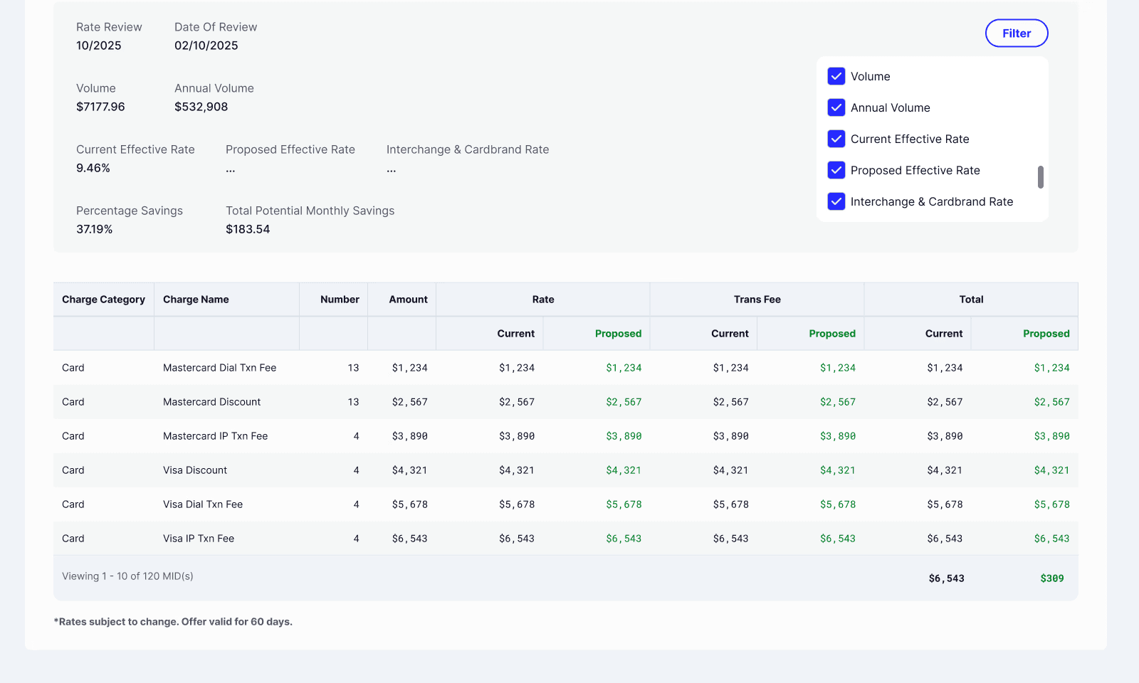
Retention advocates frequently explored multiple pricing scenarios before committing to a proposal. Rather than forcing them to overwrite one calculation after another, I treated each bulk edit as a separate proposal that could be compared before submission. Users can now compare the before and after as well as compare how it functions as an individual unit and within the whole chain account as well.
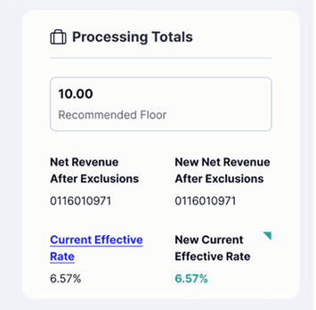
The processing totals on the left gives the final result, similar to how in school, once we calculated the answer on the rough column, we wrote/viewed our answers on the left.
09 - DESIGN DECISION 04
Merchant Acquisition And Pricing Rules
There were a lot of pricing rules and business dependencies to consider. Most users would have to spend days after submititng their proposal to determine whether it was accepted before sending it to the merchant.
I built the rules into the system, prominently displaying the recommended floor and turning the labels red when any value could not be validated. However, the user could still proceed with the same, overriding the machine with their judgement. External links were placed below to help them navigate the process better.
The Recommended Floor: The Safe Zone Guardrail
The recommended floor tells the user how low they are allowed to go without destroying the company's margins. If a deal goes below the floor, they are effectively paying the merchant to stay, creating a structurally unprofitable account.

Performance Metrics : The Decision Makers
The green and red markers gently guides the user's decisionmaking. On hovering over the flag, the user receives their respective data.

Giving The Green Light
Once users determined the pricing plan and discussed it with merchants, they can either send it to salesforce for further review or export it to send to merchants.
10 - CONCLUSION
More usage, less blockage lands faster deals
6%
Reduction In Erosion Rate
$50k
Strategic deal unblocked
12%
Decrease in volume attrition